Chart of the Month – Credit investors: beware of the re-steepening
Credit investors: beware of the re-steepening

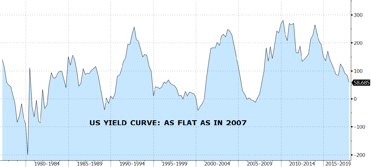
The slope of the US yield curve, which can be illustrated among other examples, by the difference between the US 10-year yield and the US 2-year yield has been widely used as an early indicator of recessions. Its normal slope should be positive, which means fixed income investors should be rewarded with a higher yield for buying bonds with longer maturities because, among other things, they sacrifice visibility on future inflation path and economic activity.
In the past, however, the yield curve has inverted various times between the 10-year and 2-year maturities. Some of those times include 1929, 1974 and 2008, where the inversion lasted particularly long and was followed by some well-known turbulences in the market.
The reason for these turbulences can be explained as follow: as the economy is slowing down, inflation is falling and unemployment starts rising, the market anticipates that the FED will have to cut rates to avoid a recession and to protect the labor market. Although the long-term part of the curve tends to move lower on the prospect of slower economic growth, the front end is much more reactive in reflecting the expected rate cuts from the FED. This mechanism creates what we call a bull steepening of the yield curve, where the 2-year yield drops faster than the 10-year yield.
The impact on credit spreads (a gauge of credit risk) is usually negative as we normally see a flight to safety during these periods of stress, where investors will favor quality over speculative assets, in other words, investment grade over high yield.
Over the last 30 years, as seen on the chart of this month, such occurrences also included the dot com bubble and the Covid pandemic. The shaded rectangles represent the period from the lowest point in the yield curve slope (in blue) and its highest point in the cycle. The dotted blue line is the frontier where the curve becomes inverted or positive again. We can see that credit spreads (in orange) have spiked in each of these periods to a cycle high.
Contrarily to a common misconception, it is not so much the yield curve inversion that coincides with spikes in credit spreads, but rather the re-steepening following these inversions. If we take the global financial crisis, for example, we can see that the yield curve started to invert in late 2005 already, without triggering any widening in credit spreads. It is only in the summer of 2007 (a few months after the curve hit the bottom and started rebounding) that the spreads spiked from a low of 240bps to a frightening high of 1’830bps.
As we can see in the chart, the yield curve has been inverted for more than 2 years in this cycle and has now re-steepened an impressive 124bps.
Today, credit spreads have remained muted and are below their historical average (the dotted orange line). It is of course not certain that history will repeat itself and that they will spike to new highs, but it is very unlikely that they will remain at such tight levels, especially given the uncertainty stemming from the approaching US elections and the two ongoing conflicts in Ukraine and in the Middle East.
Therefore, in such an environment, one should beware of the re-steepening of the yield curve and favor a higher quality in his or her credit portfolio.
Past performance is not indicative of future results. The views, strategies and financial instruments described in this document may not be suitable for all investors. Opinions expressed are current opinions as of date(s) appearing in this material only. References to market or composite indices, benchmarks or other measures of relative market performance over a specified period of time are provided for your information only. NS Partners provides no warranty and makes no representation of any kind whatsoever regarding the accuracy and completeness of any data, including financial market data, quotes, research notes or other financial instrument referred to in this document. This document does not constitute an offer or solicitation to any person in any jurisdiction in which such offer or solicitation is not authorized or to any person to whom it would be unlawful to make such offer or solicitation. Any reference in this document to specific securities and issuers are for illustrative purposes only, and should not be interpreted as recommendations to purchase or sell those securities. References in this document to investment funds that have not been registered with the FINMA cannot be distributed in or from Switzerland except to certain categories of eligible investors. Some of the entities of the NS Partners Group or its clients may hold a position in the financial instruments of any issuer discussed herein, or act as advisor to any such issuer. Additional information is available on request.
© NS Partners Group